
My Virtual Studio: Watercolors and Palettes
Watercolors come in various forms – liquid (bottles with droppers), tubes to squeeze out paint, pans of dried paint, powdered, and sticks (crayon-like). Quality varies between them, as do properties. And something I’ll remind you of regularly throughout this class: you get what you pay for. Buy cheap socks and they’ll burst holes in the toes fast, but pay a lot for nice thick socks, and you’ll have them for years!

A few watercolor definitions
Pigments: Each color is made of pigments – some synthetic, some natural. I’m not going to explain that in deep ways here – but know that some similar pigments are mixed with other things to come up with different hues. Manufacturers use their own proprietary mixes, therefore sometimes a color will look different in one brand from another, so knowing the brand can be important.
Transparency vs opacity: The amount of pigment that “covers” another or is more “see through.” Transparent colors layer atop others and don’t become cloudy, whereas opaque or semi-opaqe can appear chalky. Sometimes that’s desired (as in signing a painting in an opaque color, or adding an opaque white highlight on an object), and other times those colors ought to be avoided.
Granulation: The amount of texture in the pigment. It varies for different colors; it’s caused by natural minerals that some pigments are made from; color settles into pockets and creates variations in color and texture (PrimaTek paints in the Daniel Smith line generally granulate, to different amounts.) Sometimes the granulation isn’t visible until pigment is applied heavily, and sometimes it’s exaggerated when mixed with other particular hues.
Lightfastness: Refers to how well painted pigments withstand light. With some craft brands, they don’t even rate them because projects are not intended to withstand the test of time. But with good brands of paint, the manufacturer should let you know what the ratings are. NOTE that lightfastness can change from one hue to another within a brand, too. If you mix a purple from any blue + Daniel Smith Opera Pink, a “fugitive” color that doesn’t withstand light well….eventually your work will only have blue left, as the pink will disappear.
Forms of watercolor
There are many forms of delivering watercolor to paper – companies mix them to different levels of solid/liquid to allow an artist to create different techniques with each. A short description of them follows, along with my favorite brands.
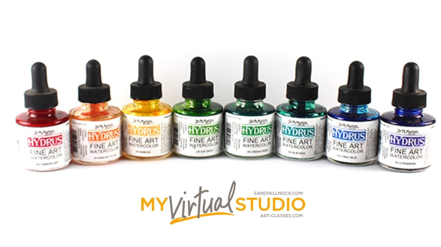
Liquid watercolors: Not the most common, and I’m not deeply experienced with them, however I have a few thoughts to share: these are great for letter-ers! Liquid watercolors are at a movable consistency in their bottles – dip a brush in and you’ll always end up with the same color at the same mixture of pigment v water (which is incredibly hard to do mixing your own!). I have had a number of crafty brands, and wasn’t overly thrilled with them; however I still love my phMartins Hydrus watercolors. These are VERY strong in pigmentation – think of them as the inktense version of watercolor, because they’re bright, and once dried, they don’t move, so you need to work fast to soften edges. They’re also excellent for bright pigmentation in Bible journaling – and despite all that color, they don’t bleed through Bible paper at all.
- Liquid Watercolors: Ph Martins Hydrus
- Download a free color chart to help you decide which set or colors you’d like.
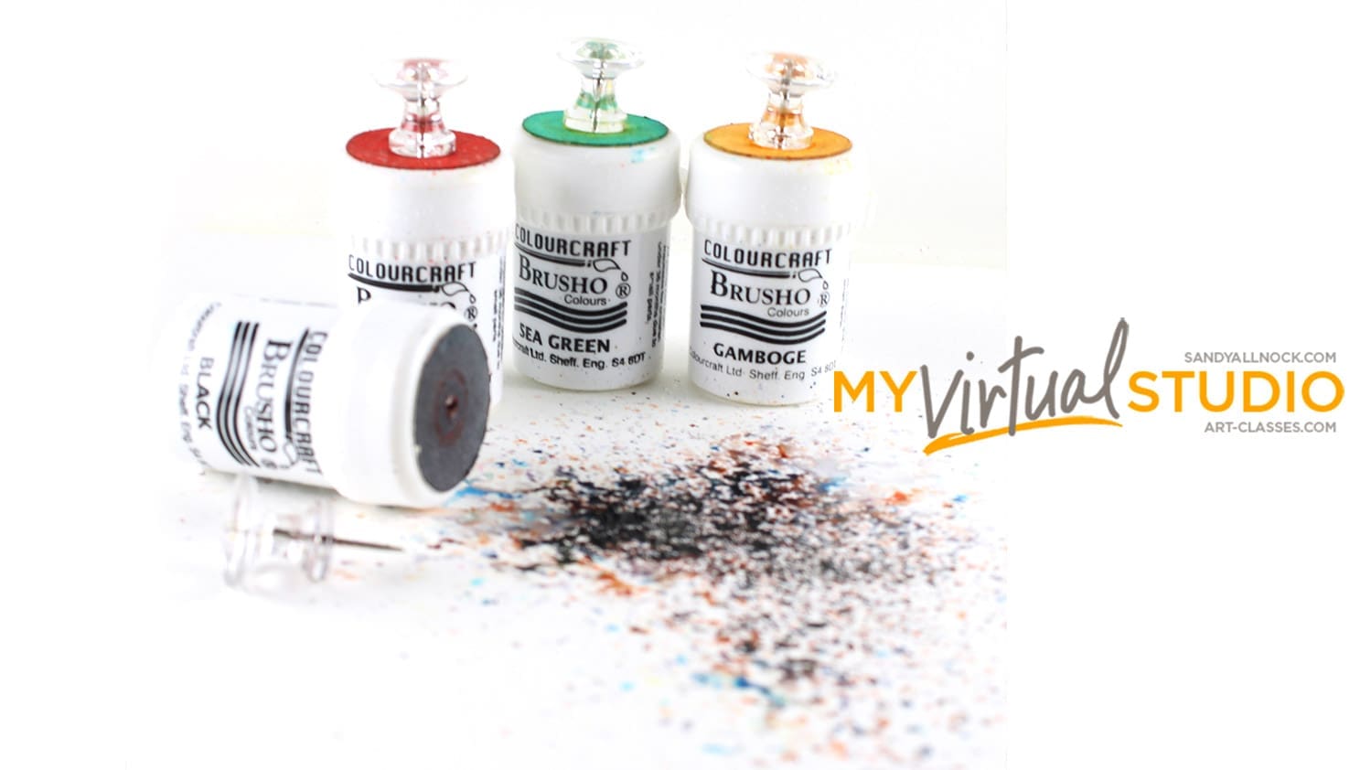
Powdered watercolors: Pure pigments in powder form can achieve results many other types cannot – they are highly concentrated, and can burst into colors that are amazing. Great for galaxy type skies. They’re fun to play with – messy but fun to watch them break out into colors, textures and patterns! Even children can make lovely works of art by spraying water and sprinkling. See the video at the end of this lesson for more information.
- Artist quality powdered watercolors: Brusho Crystal Colors,
- Download a free Brusho color chart to help you decide which colors you might like.
- Craft-quality (and more expensive per oz) : Colorburst.
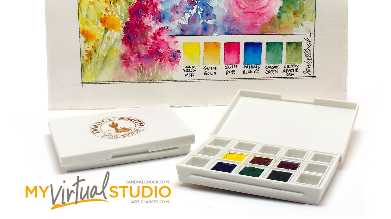
Pan watercolors: These pigments have been poured into pans (little plastic squares or rectangles) by the manufacturer; little known fact, to pour them so perfectly, these are manufactured slightly differently than the same colors in tubes, so they settle in well! When a company pours pans, they’re way more efficient than when we squeeze out our tubes, because their processes remove air bubbles; so purchasing pre-poured pans delivers more pigment for the money. Pan watercolors can be of high quality, student grade, or craft quality, so still look at the set’s information to find out what you’re buying. I’ve used the Koi and Gansai Tambi watercolors, and find them both to be chalkier than fine art grade paints but quite adequate for crafting! Currently I do use the small sets that Daniel Smith came out with in 2018, they’re excellent for travel.
- Pocket Field Sketch Box, Sakura Koi Watercolors
- Pan watercolor sets, Kuretaki Gansai Tambi,
- Half pan sets, Daniel Smith
- Download free lists of the Daniel Smith half pan sets plus swatch paintings.
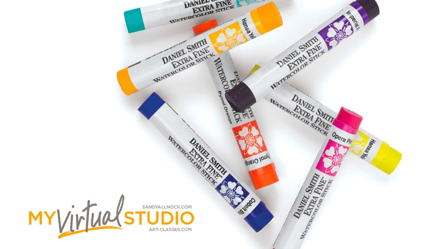
Stick or crayon watercolors: Some manufacturers package the same pigments in stick or crayon format; they can be used as drawing tools and moved with water – or can be used in lieu of pans of paint, touching a brush to the end of it to pick up color. Quality of the pigments is the same, in general, as the manufacturer’s regular line; and since the pigments are compressed into stick form, they are often cheaper per ounce of color. Some artists I know crush them into their pans, since they’re more cost-effective. I have the Daniel Smith sticks that I use mostly when traveling, and if I ever find time to explore deeply with them to be able to offer enough new information, a class may happen at some point!

Dot charts (cards): Daniel Smith, and possibly some other companies, makes dot charts of their pigments so artists can try them out first to decide what colors to purchase. It’s a great way to pick your palette; you can see which are warms and cools (see my recommendations above), which granulate, etc. There’s a decent sized dot of paint on them, enough to try them out. They come in several sizes:
- Daniel Smith Dot Card, 238 colors, EH or BLICK
- Daniel Smith Dot Card, 66 colors, EH or BLICK
- Daniel Smith Dot Card, Sandy Allnock 18 colors, EH
And yes, after they dried I did put them in a plastic page in my swatchbook. They dry pretty well!
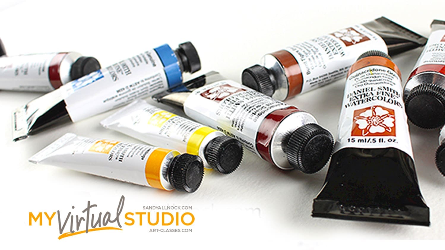
Tube watercolors: Pigments are pliable enough to squeeze out of a tube into a pan, and after they air dry overnight, they are solid and can be rewet to paint. Squeezing out paints requires having something to squeeze them into or onto: use a plate or butcher tray, preferably something white to see color accurately, or purchase an empty palette (more info below) to squeeze colors into. It used to be that tube watercolors were all either artist-grade or student-grade, but in recent years, companies have begun to make craft- and child- grade paints, so buyer beware! As always, what you spend will reflect the quality you receive. Tube colors come in 15 or 5ml; I only purchase 15ml nowadays, knowing I’ll use it all eventually! Note that Ellen Hutson is going to begin limiting her stock to the 5ml; links below are for the 15ml so some may not work if she’s already out of that color.
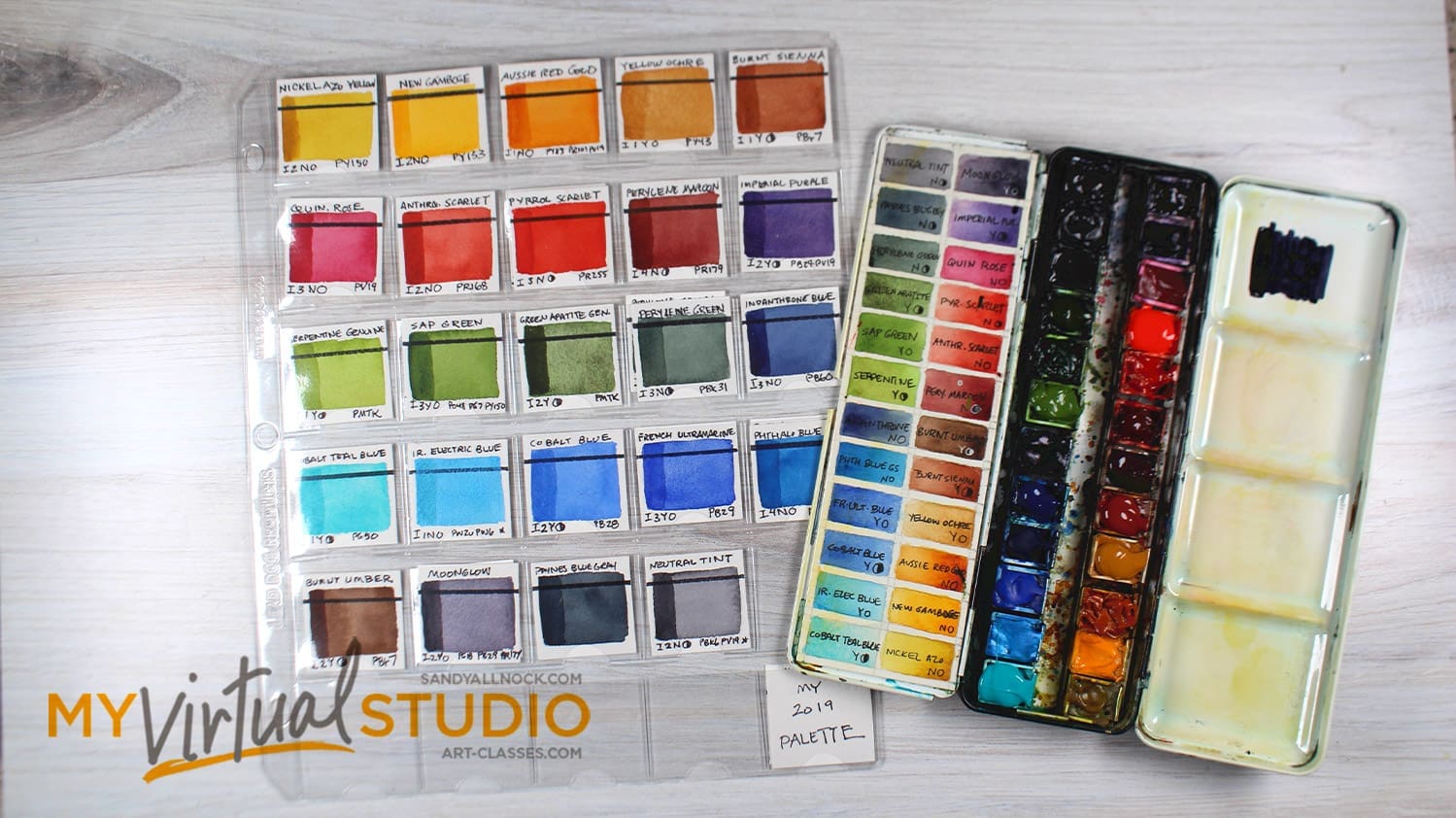
My watercolor selection
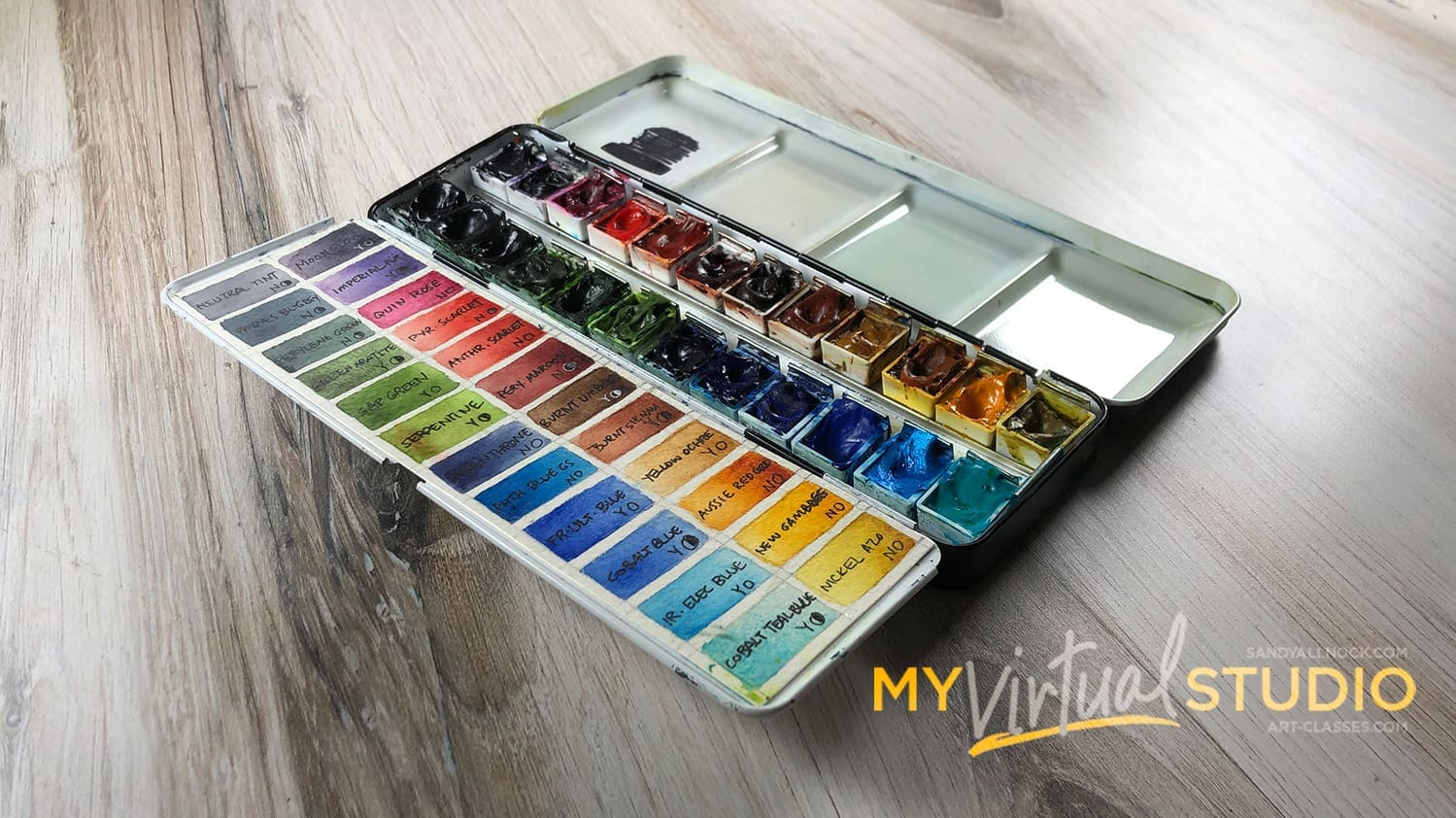
Generally artists speak of their “palette” – it’s really their selection of colors, as few have a physical palette named after them! The colors in my current palette are as follows – for 2019-2020. (I change out colors every 2 years or so, and have a few others I play with in the studio aside from these).
- Daniel Smith watercolors:
- Nickel Azo (EH or Blick)
- New Gamboge (EH or Blick)
- Aussie Red Gold (EH or Blick)
- Yellow Ochre (EH or Blick)
- Burnt Sienna (EH or Blick)
- Burnt Umber (EH or Blick)
- Perylene Maroon (EH or Blick)
- Anthraquinoid Scarlet (EH or Blick)
- Pyrrol Scarlet (EH or Blick)
- Quinacridone Rose (EH or Blick)
- Imperial Purple (EH or Blick)
- Moonglow (EH or Blick)
- Cobalt Teal Blue (EH or Blick)
- Iridescent Electric Blue (EH or Blick)
- Cobalt Blue (EH or Blick)
- French Ultramarine Blue (EH or Blick)
- Phthalo Blue GS (EH or Blick)
- Indanthrone Blue (EH or Blick)
- Serpentine Genuine (EH or Blick)
- Sap Green (EH or Blick)
- Green Apatite Genuine (EH or Blick)
- Perylene Green (EH or Blick)
- Payne’s Blue Gray (EH or Blick)
- Neutral Tint (EH or Blick)
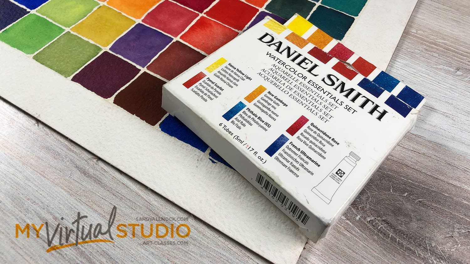
Essentials: Cools and warms
If you want to try a few Daniel Smith colors and don’t know where to start – I recommend the Essentials set of 6 colors. It has a red, yellow, and blue warm and red, yellow, and blue cool. Those colors combined both within temperature and also with each other color can create a wild array of colors – and making a chart to test that out gives you a great idea how to make colors out of two different ones. See the videos at the end of this lesson for more on making a chart like the one above.
Making your own selection of colors
Whatever form of watercolors you decide on, picking colors is important. Having *every* color is not needed, as watercolors are made for mixing; collecting all the colors might help a crafter to match inks if that’s the project goal – but it won’t make anyone a better painter to buy them all.
To become a better painter, chooose a selection of colors and spend time with it. Even as a professional artist and teacher, I generally use one palette of colors for 2 years before changing it out and coming up with a different selection. That provides time to really see how colors perform and mix in a wide variety of situations, and to discover which colors just aren’t being used and should be voted off the island!
My recommendation: Get a dot card and swatch some colors. See what you like. When picking out colors, start with primaries. Choose a cool red, cool yellow, and cool blue, along with a warm red, warm yellow, and warm blue. If that’s all you had you could mix an infinite variety of colors! Most palettes have room for more colors, though, so I would add:
- the colors that you are tired of mixing
- colors that have interesting properties.
For example: I include Sap Green in my selection, though in my fine art rarely use it or any other green alone; but it gives me a base that I really like and can add to, and I got tired of mixing from other colors. And Moonglow is in my palette because of the elegant way it breaks into colors as well as textures. I could never mix a color like that on my own. And Nickel Azo, because, well it’s just freaking amazing. LOL.
Palettes
When I began painting, I loved giant plastic palettes with as many spaces for paint as I could find! I wanted all the colors available all the time. Every time I took a watercolor workshop, I added the instructor’s colors, and figured that would grow my collection.
But what I found was I still only used certain favorite colors – and was overwhelmed with the massive number of colors in my huge palettes! I had enough colors I never had to play with some that I just didn’t resonate with – and they sat there taking up real estate.
I switched to a smaller palette, metal, with fewer spaces for colors. 24 is even more than needed – and I’ve got a palette on order that holds just 15! (Pretty excited…there’s a 2 year waiting list for a House of Hoffman, so I will finally get mine in about a year.)
In the meantime, for a few years now I’ve used a Schmincke palette (with the logo scribbled so as not to confuse people about the paint brand) with Daniel Smith paints (listed above) in the half-pans. There are four wells for mixing – and a flap on which I’ve attached a color key. (Video at the end of this lesson for how to do that.) I have a color key there more for people watching on YouTube than for myself, since I know my palette so well that I don’t need to reference colors.
- Schmincke Palette at Ellen Hutson | Blick
- Half Pans at Ellen Hutson | Blick
- House of Hoffman palettes

Swatching watercolors
Making swatch cards or sheets of mediums is often the first thing people do; it can be satisfying to make a rainbow of some kind. There are limitless ways to make swatches – and my chosen method, shown above, is making 1.5″ squares and putting them into pocket pages. (Get them at EH or AMZ.)
I generally am NOT a “swatcher” – . I find I get to know any art supply better by using it in context on a piece of art; when painting, we rarely make little squares of color next to each other, so how it performs in that context is fairly useless.
What swatching IS good for:
- Documenting colors you own. It can stop you from repurchasing a color.
- Noting properties – like whether the color is opaque or transparent (Make a black line on the swatch with a thick sharpie, then painting over it, shows whether the color is opaque. In the below samples, the Cad Red partly covers the black line.)
- Assessing data – like pigment information, etc. Writing down those notations is helpful for those who want to compare one company’s hue to another and figuring out why they function differently. If using different brands, devise a key of some kind to remind you which brand it was.
- Visual color list – photographing colors used to add to a blog post to allow readers to know what colors were used.

Related lessons:
See the following lessons on Brushes, paper/sketchbooks, plein air/studio, and watercolor pencils.
Powdered Watercolor Video:
Dot card video:
My palette for 2019
Swatch charts with Essentials set
Join our creative community! Our Student Facebook Group is for all classes here …and while there are no finished projects in this class, you’re welcome to join the group and get an idea of what kind of beautiful works can be created from learnings in classes on this website!
Discover more from Art Classes
Subscribe to get the latest posts sent to your email.