
My Virtual Studio: Copic Numbering System, Paper and Sketchbooks
The Copic color number system, to many, seems like it makes no sense – and I know many who go by name rather than number in selecting markers. But if you can spend a little time grasping how they’re numbered, and set aside a few anomalies (ha!), the numbering system does help in choosing colors!
The Copic Jumpstart class goes through color theory in great detail as well as covering the numbering system, but this lesson includes a little bit of the basics.

Each Copic begins with one or two letters:
- Y=Yellow
- YR = Yellow-Red
- R = Red
- RV = Red-Violet
- V = Violet
- BV = Blue-Violet
- B = Blue
- BG = Blue-Green
- G = Green
- YG = Yellow-Green
- E = Earthtones
- Greys: T = Toner, W = Warm, C = Cool, N = Neutral
The first digit after the letters indicates the saturation of color. Not the light/dark – but the intensity of color. If you’re a person who likes strong, bright colors, choose markers with a low digit; if you’re like me and like to use natural, desaturated colors, the higher numbers will be your friend.
The second digit indicates the light/darkness of the color – the lower the number, the lighter the color; the darker the number, the darker it is. The exception: there are some markers with multiple 0’s, and the more 0’s, the lighter the color.
In my classes and videos, you won’t hear me refer to the two digits by their combined number – ie I’ll say “Y one seven” instead of “Y seventeen.” That’s because the 1 and 7 mean something completely different – seventeen has absolutely no relevance!
Copic-friendly Paper
There are a number of papers that will work with Copics – it all depends on the user as to what is “best.” It may also depend on what country you live in, because not all papers are available worldwide.
One thing to note: many seek papers that will not bleed through, and I strongly recommend against setting that as a criterion. Copics are meant to blend within the fibers of the paper – if you look for something that won’t bleed through, it’s significantly harder for the ink to blend in the paper – it sits on top, and often dark colors will puddle and pool and become shiny or sticky on the top of the surface. Even 110lb paper is thick enough it suffers from those problems.
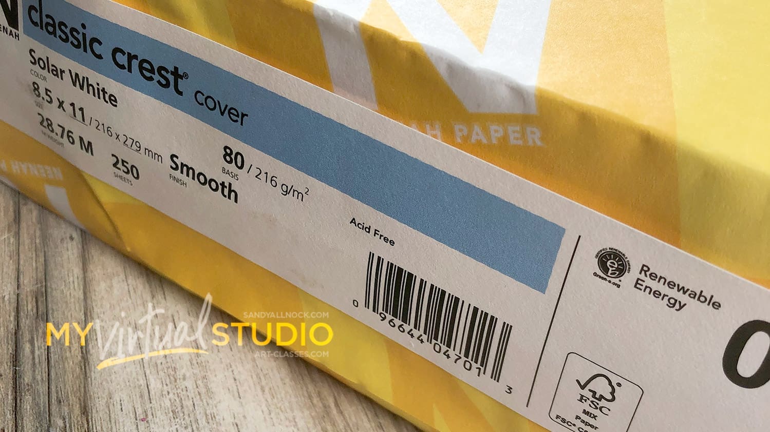
The cardstock that is by far my preference is Neenah. The Solar White or Natural White are both great, just slightly different types of white; just be sure NOT to get the packs at the office supply store. Neenah makes an office version that has too soft of a surface and isn’t as thick as those linked here.
- Neenah Solar White 80# Cardstock Ream EH
- Neenah Solar White 80# Cardstock 25pk EH
- Neenah Solar White 110# Cardstock 10pl EH
- Neenah Desert Storm Cardstock 25pk EH
Copic-friendly Sketchbooks
The Sketchbook made by Copic is on their paper, which is on the slick side and does bleed through – but it does blend well! For those used to Neenah there’s a little getting used to the surface and being aware of how much ink to put down to blend, but it’s a great sketchbook.
- Copic Sketchbook – AMZ
Folks ask me about a sketchbook that doesn’t bleed. The RENDR one, shown in this video, does a GREAT job of not bleeding through, but has other drawbacks; the paper is greyish, and colors aren’t 100% accurate. However you can easily use both sides of the paper, and it works great in that way!
Join our creative community! Our Student Facebook Group is for all classes here …and while there are no finished projects in this class, you’re welcome to join the group and get an idea of what kind of beautiful works can be created from learnings in classes on this website!
Discover more from Art Classes
Subscribe to get the latest posts sent to your email.