
Color Theory: Ella Preclass
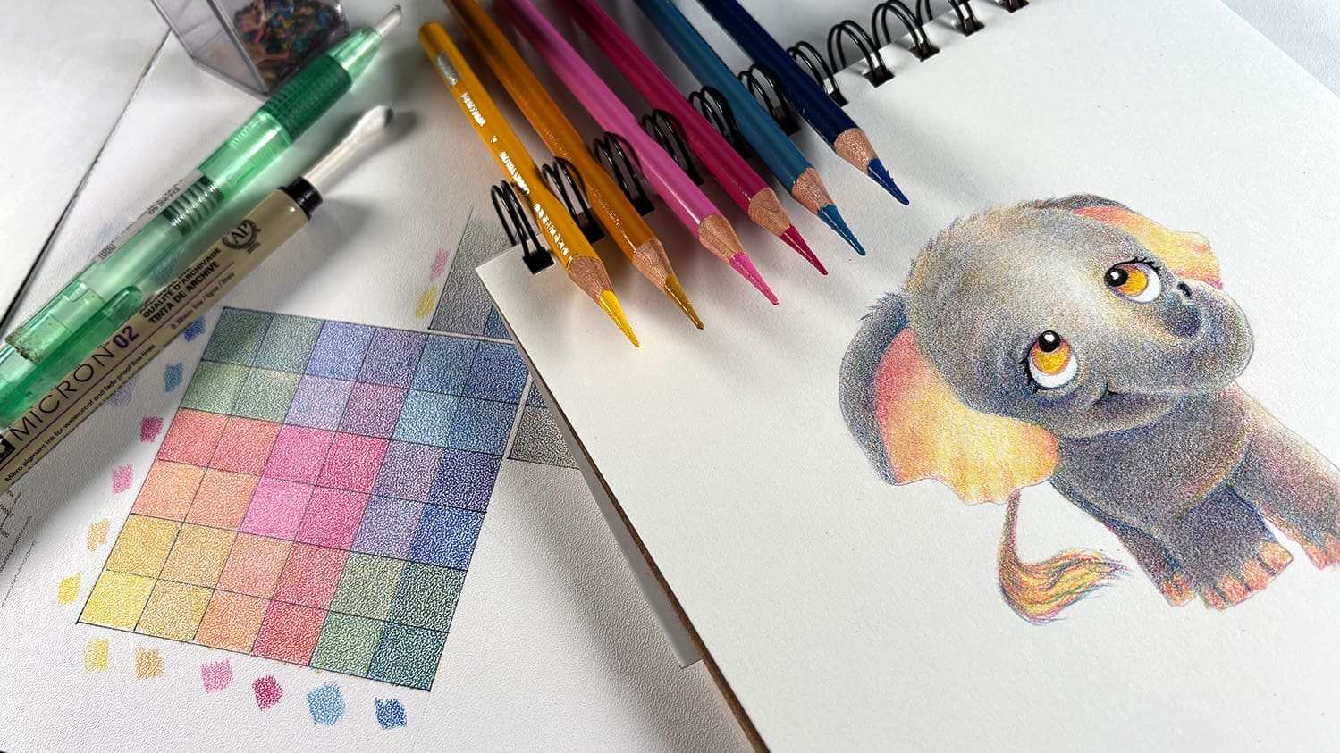
Welcome to the Preclass lesson! We’ll be discussing the supplies used – feel free to use the brands of papers and pencils that YOU love, you’ll learn plenty in this “snack sized course” no matter what you’re using!
Before we start…a little housekeeping
I retain the copyright to the content you are learning in class. That means…
- Do not sell or give away the concepts from my classes – you may not re-teach my instruction contained or created within these lessons.
- Do not post a video tutorial or step by step photo tutorial of your own redraw of class content.
- Do not repost any handouts you receive in class.
However…I love to see students making strides and taking this teaching and personalizing it with your own skills.
- DO make your own designs and develop your own style! I love that!
- DO gift your creations made with these techniques, of course!
At the bottom of each lesson you’ll see some ways to share your homework and ask questions, so that’ll be handy for you.
Supplies
You might already have the items listed here – or something similar
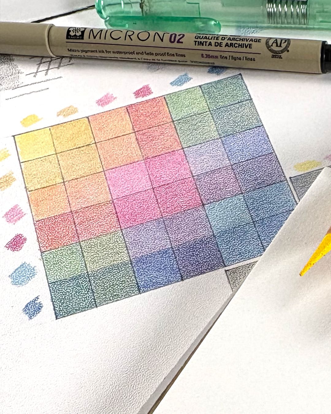
The colors are shown below – a light and medium yellow, light and medium pink, and light and medium blue. The colors for these two brands are as follows, but find something similar and you’re good to go.
- Prismacolor: 916, 942, 993, 994, 1022, 906
- Polychromos: 107, 183, 128, 125, 140, 151
Note that the swatching here has been done on stipple paper (not required paper for this class) – your results will look a bit different depending on the texture of your paper.
Colored Pencils
Use any brand you find works in your Bible. In this course Prismacolors will be used; download the color chart for options in a few other brands.
- Prismacolor Premier Colored Pencils BLICK AMZ
- Faber Castell Polychromos Colored Pencils BLICK AMZ JACKSONS
- Caran d’Ache Luminance Colored Pencils BLICK AMZ JACKSONS
- Derwent Lightfast Colored Pencils BLICK AMZ JACKSONS DERWENT
Paper
Use your own favorite! This one’s mine:
Tracing
Lots of options here – use a Light Box, tape it to a window, or put a flashlight under a glass table surface!
Sharpeners
A few of my favorite options…
- Afmat Long Point Pencil Sharpener AMZ
- Afmat Long Point Pencil Sharpener USB rechargeable AMZ
- Dahle Dual hole pencil sharpener BLICK AMZ
Blending
- Qtips
Misc
Share homework & ask questions
Artventure Community
Join our active art community of thousands of artists on the Mighty Networks app or on the web. You can get quick feedback, help, and answers, as well as getting to know other artists near you and around the globe! Free to join.
Monthly Open Studio
Sign in for one of our Zoom calls – “office hour” as a community! Submit work for critiques, questions about techniques, get to know fellow students! See the calendar at Artventure for upcoming dates. Replays available free for 1 week.
Discover more from Art Classes
Subscribe to get the latest posts sent to your email.